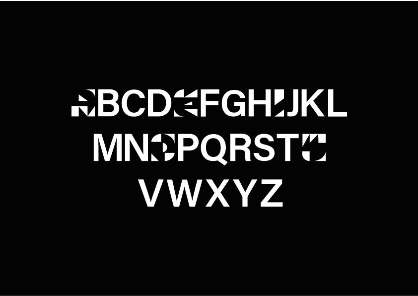
Bio

Hello!

Rosie McLelland here, thanks for taking the time to look through my work from my time at University. You'll find various projects here which aim to sum me up as a designer. My work consists of strong concepts and big ideas that, to me, make sense.

If you have any questions, thoughts, feeling or opinions feel free to pop me an email and lets have a natter.


There's A New Dram In Town

This project concept was shortlisted to the BrandOpus Chrysalis Student Awards in 2020.

5ive is an environmentally conscious whisky which uses spent grains rather than using resources to grow new grains for distillation. The name 5ive refers to the 5 environmental r’s (reduce, reuse, repair, recycle, rethink), the 5 main steps in whisky production and the 5 steps to expertly taste whisky.

The brand aims to encourage and introduce new people to the world of whisky-specifically young adults who have previously been too intimidate to try it before. 5ive aims to break the preconceptions of who drinks whisky and what it should look like. The concept behind the label design itself is late night sunsets, approachability and uniqueness. 5ive wants to spark questions and become the talking point on the shelf.

Reduced 5ive logo.
Front and back view of the whisky label.
Hostility Sans

Hostility Sans is an online censorship tool which aims to prevent hate speech and online harassment. It is aimed at those who attempt to spread online harassment. The typeface recognises potentially harmful speech and takes possession of the words, rendering them almost unreadable-it hides words in plain sight. The tool only distorts vowels as these are an integral part of how the word sounds when spoken.

The typeface takes possession of these words, hindering readability and therefore removing their power. The vowels themselves in the typeface are constructed using triangles, a shape with strength, and negative space that alludes to the anonymity and fragility associated with hate speech. This typeface is a protest and the importance is what the typeface does, not what it looks like

Consonants are Acumin Variable.

The typeface name written in Hostility Sans to display the reduced readability once in action.
The full set of glyphs.
The phrase 'this is a protest' written in Hostility Sans.
Hostility Sans vowels.
Blue Marble

This was a logo I created as part of my entry to the ISTD Student Awards 2021. I conceptualised and designed a publication called Blue Marble which aimed to encourage designers to reconnect with nature to aid their general wellbeing. The name was taken from the Apollo 17 image of the Earth. With a strong theme of the planet and engaging the senses, the logo explores motion by using a single symmetrical shape rotated to form both initials. 

More images of this project can be found on my Instagram.

Blue Marble logo.
Something Fishy Is Going On Here...

The book (in the sense that a book is simply an object telling a story) visualises the issue of plastic pollution in the oceans by modifying a recognised household to display the effect we are having on our oceans. The clean, familiar front and back covers create juxtaposition between the contents of the book and enhances the shock factor.

The reader is positioned to that of animals (specifically sea birds) and brings attention to the double standards of allowing birds eat polluted food. Both people and birds eat fish, but we have the luxury of being able to clean, prepare and distinguish between what is food and what is not. This book removes this luxury as a stark reminder of the part we play in polluting oceans. Moreover, people are only concerned when they/their daily lives are affected personally.

Read the text on the following images carefully.

Front cover.
Front view of open book showing contents spilling out.
Close up shot of sardines mixed with plastic.

P.S. I am currently based in Edinburgh and looking for design work-wherever that might be!