Project description

My final project revolves around Studio Hideout, a campervan conversion studio founded by myself, which I will be running post-university. I had tasked myself to create an identity for my business, this was a challenging yet extremely rewarding process. 

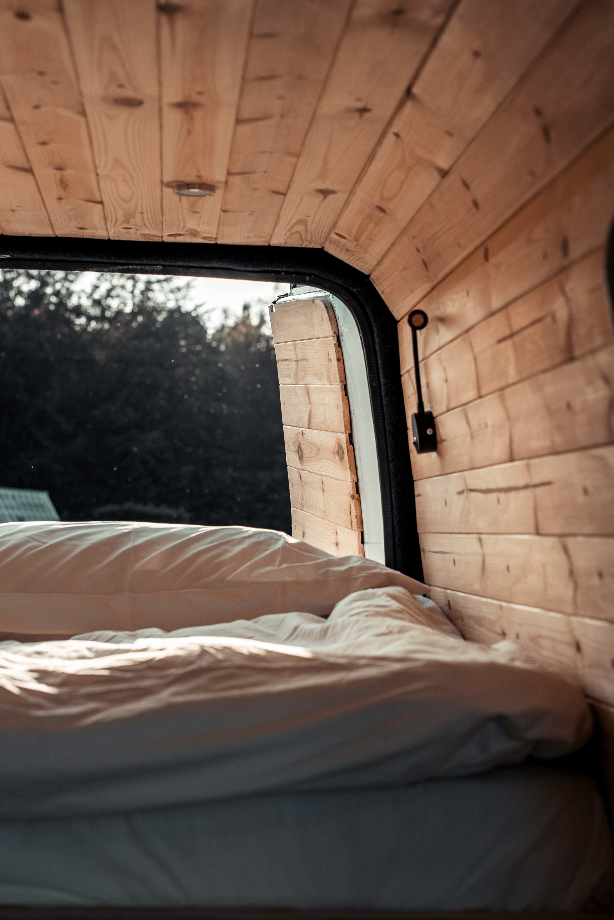
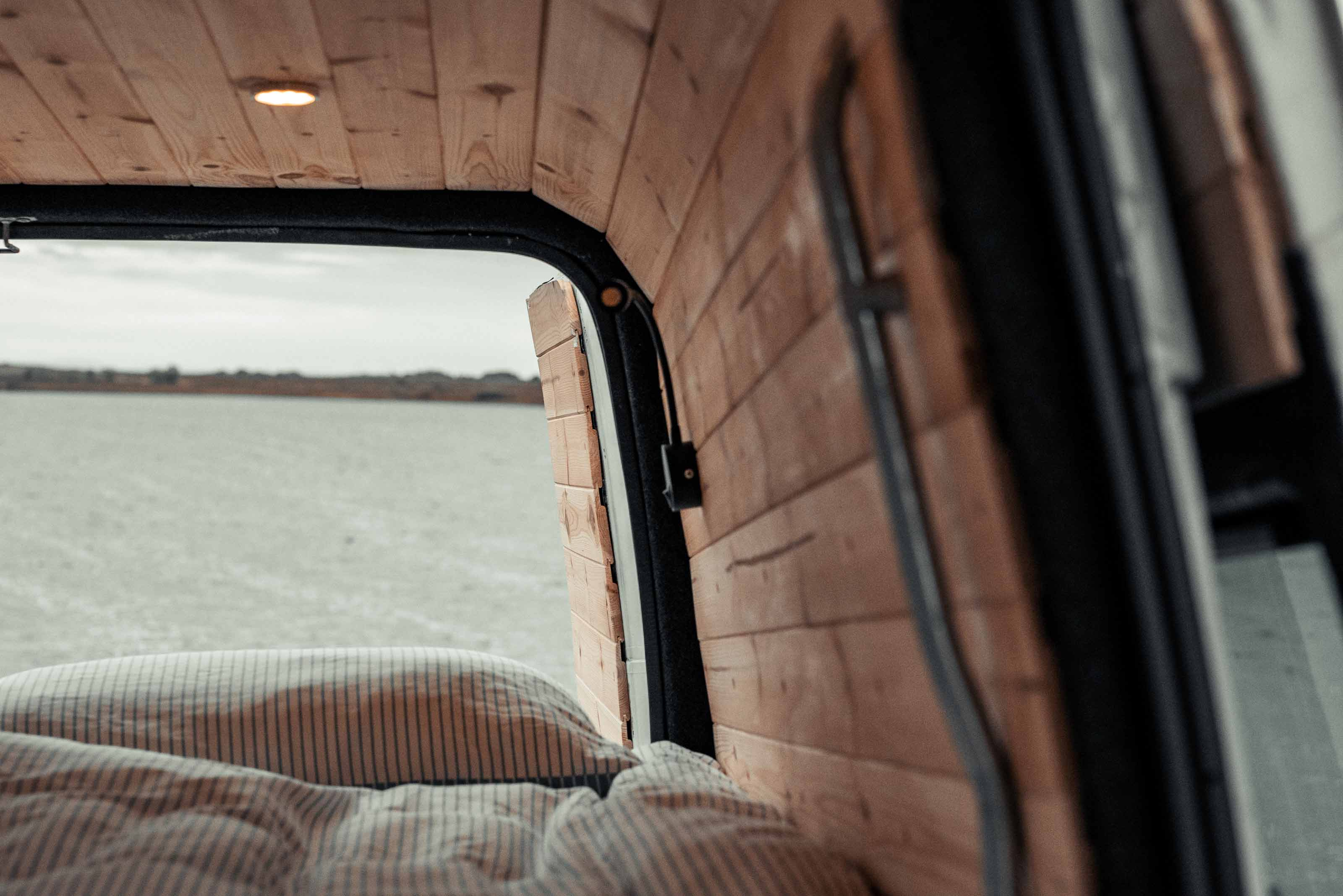
My vans have a strong focus on natural materials, with a keen set of eyes always looking for interesting patterns in the plywood or cork flooring. A carefully curated mix of materials ensure a timeless visual experience is created, across the range of textures and colours. Creating a brand which reflected these values, had longevity and could stand out from the competition were my key objectives. Studio Hideout needed a brand which could cut through cliche imagery and push the brands emphasis on craft, detail and experience to the forefront.

Bed View
Kitchen
Logo Lockup
Mark

A geometric take on the letter 'h' in the name created a mark which reflected OS map icons for shelter, further embodying our drive to explore places new. The angular, slender forms of the mark create the sense of precision, skill and craft in Studio Hideouts van builds.

H
Business Cards
Creating an Experience

A mix of pastel colours reflect the natural materials and landscape in and around the van, evoking a subtle retro feel which camper van buyers are drawn to. A mix of strong light and texture in the imagery creates an honest and natural quality throughout the brand.

Instagram
View

Background:

Studio Hideout embodies an alternative approach to the camper van, re-focusing values on the form, function and aesthetics of these small spaces. Our process uses a standard panel van as the base, we transform these unassuming vehicles to create spaces that inspire adventures on the road.


Please get in touch if you wish to discuss your very own Hideout van.

hi@studiohideout.co.uk